June 14, 2016
Looking back on our journey as a design studio, one of the biggest areas of growth has come in the form of our design process for client builds, but also for our own endeavours.
Looking back on our journey as a design studio, one of the biggest areas of growth has come in the form of our design process for client builds, but also for our own endeavours.
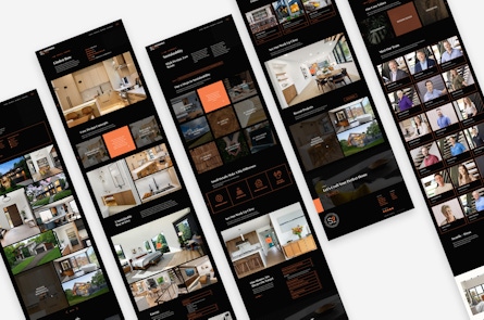
It’s been quite some time since Authentic Form & Function approached a redesign of our own company website. Since we opened our doors three and a half years ago, much has changed for the better: our growth as a team, internal processes, and improved workflows for client projects.
Design has long been a subjective force in creative fields. What one person loves, another may loathe. On the web, there are certain practices that are typically adhered to, but then again, when it comes to aesthetic direction, opinions will vary drastically.
With that said, how do we wrangle design decisions and how did we approach our own re-design process? A little over a year ago we sat down to do our best to figure out this rather ambiguous issue in the greater project timeline.
Something we’ve seen over time is the Don Draper “pitch” approach, showing a client 3-5 directions, and hoping there’s a bite on at least one. However, what typically follows is the almost predictable response, the melding of design directions, and an aesthetic approach sitting in muddy water. Everyone involved becomes fairly apathetic.
Something has to give: either the sanity as a design team, or the process with which we approach those situations. In the end we decided to break down our design process into three core buckets. Tangible break points during the larger process where we could encourage both participation and buy-in (i.e. approval) before proceeding. Those buckets are:
You might see the term mood boards and cringe a little bit, but hear me out, there’s a reason why various boards have stuck around for so long. They let us visualize an end product by casting a wide net and give us a visual layout to work off of. Think vision boards, magazine clippings, and Pinterest.
The general “vibe” of color, layouts, and photographic direction are at our disposal from the beginning, and that’s a step worth taking in my opinion. Let’s talk about design expectations early and often. What do you like? What don’t you like? Why?
For the Authentic redesign project, we came up with three different moods. We found inspiration around the web, photos we admire, and even fashion we like. It allowed us all to talk through what we were seeing right away, honing in on that general direction from the very beginning.
Once everyone’s on the same page for the greater aesthetic direction, we press pause on pretty pictures and focus on the strategy of the project (or product) at hand.
What does the sitemap look like? What content will go where? Where should we be planning for calls to action, photography, and other important strategic elements?
Wireframes serve as the “black and grey” portion of the project . I always tell clients that this is the time where we flip off our design brain and turn on our strategic brain. Just as important as the presentation of the project will undoubtedly be the strategy behind it.
As we planned each page of the new Authentic website, we conducted internal reviews on each page in the wireframes, too. We wanted to be sure the site hit on specific goals, would allow us to gain more metric data, and of course, showcase our previous work.
By addressing a design-neutral skeleton of the website before adding any aesthetic treatments, we’re able to capture further buy-in within a contained environment.
As a designer of many years, the visual design of any project still feels the most exciting. It’s like opening a little present each time color, fonts, photography, and other elements become incorporated in the greater plan of action.
During this final phase of the process we combine the aesthetic preferences we’ve discussed with the strategic decisions we (collectively) made along the way, too.
What’s nice for the design team at this point—and the end client—is that there aren’t any surprises. Instead of the big Mad Men unveiling, we have a thoughtful design presentation that reaches back to both our aesthetic and strategic decisions. If there are new questions or concerns, that’s OK, and we’ll review those accordingly. If a few things need adjusting, we build in time for those conversations.
A key benefit of this process is that everyone feels heard. From the design lead, to a developer chiming in, to the greater client team, we’re hearing everyone along the way.
We take notes at every handoff, being clear what we heard on a call while gaining clarity on what next steps look like. Unlike some, we’re not going into a design cave for 4 weeks with the hope that what we produce is met with fanfare.
For the latest Authentic website launch, the same was true for our team. We took our own medicine, so to speak, and we couldn’t be more thrilled with how things turned out.
Like anything digital, we’ll be forever finessing and honing, tweaking calls to action and peering into analytics data points along the way. That’s the part of any project we love, too—fine tuning a machine that was already built with such purpose.
Beyond a fresh website launch, our biggest takeaway was the inspiring way with which we approached the project as we do with any client project: welcoming inspiration and making sure everyone’s heard along the way.
Subscribe here to get our short and sweet monthly newsletter!