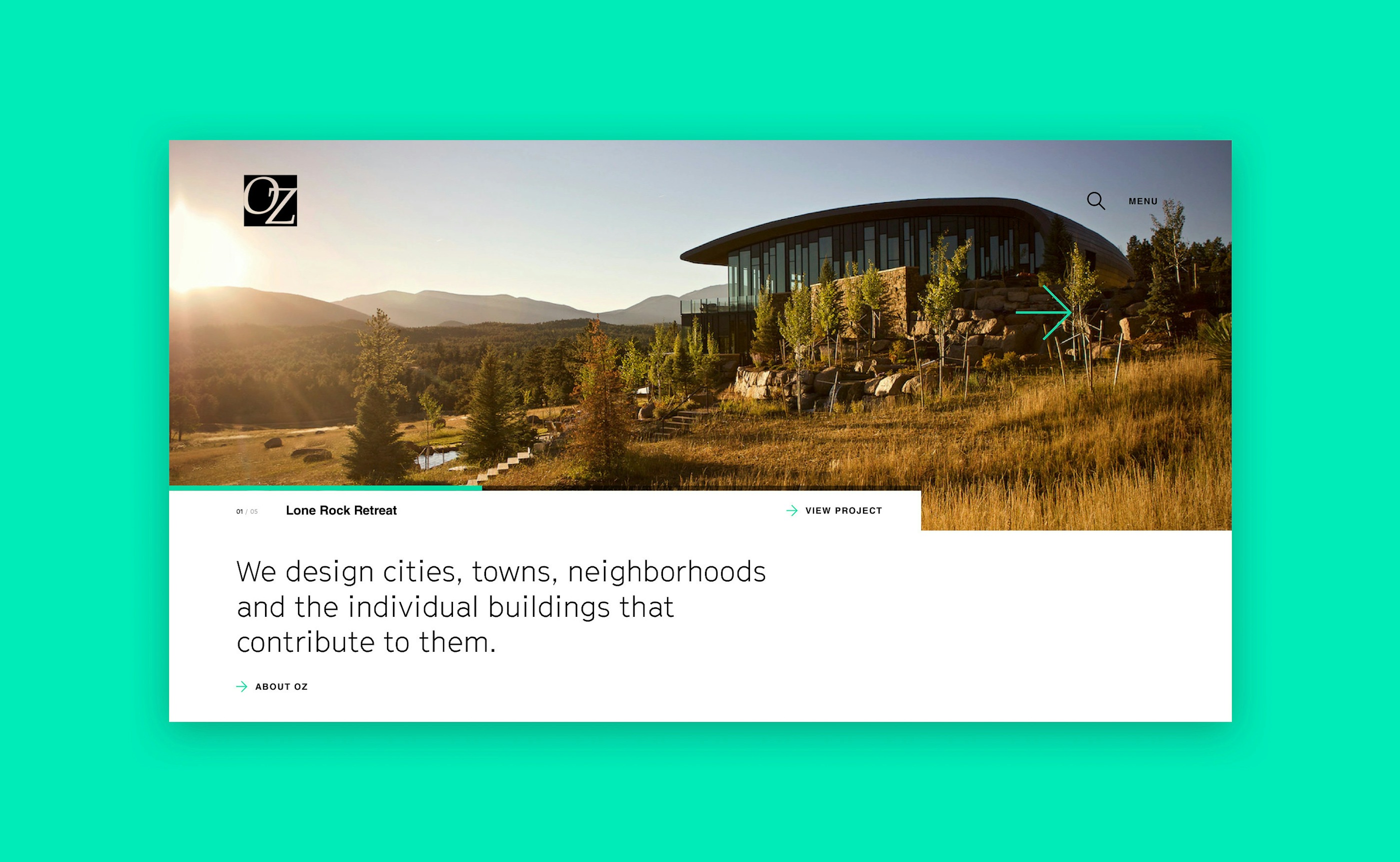
OZ Architecture was founded on the belief that collaboration coupled with diversity sparks design creativity. We helped them spread the word with a revamped website.
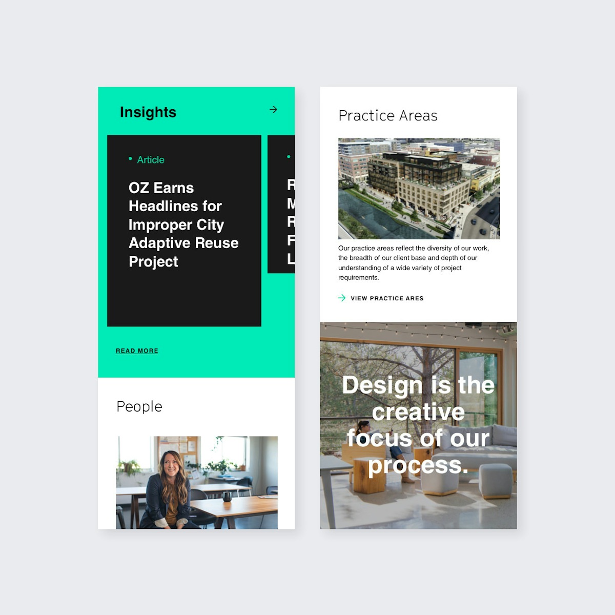
OZ Architecture's practice areas reflect the diversity of their work, the breadth of their client base, and a deep understanding for a wide variety of project requirements. As this multi-faceted team has evolved over the years, so too did the latest challenge of bringing forth a more modern representation of the evolving OZ leadership.
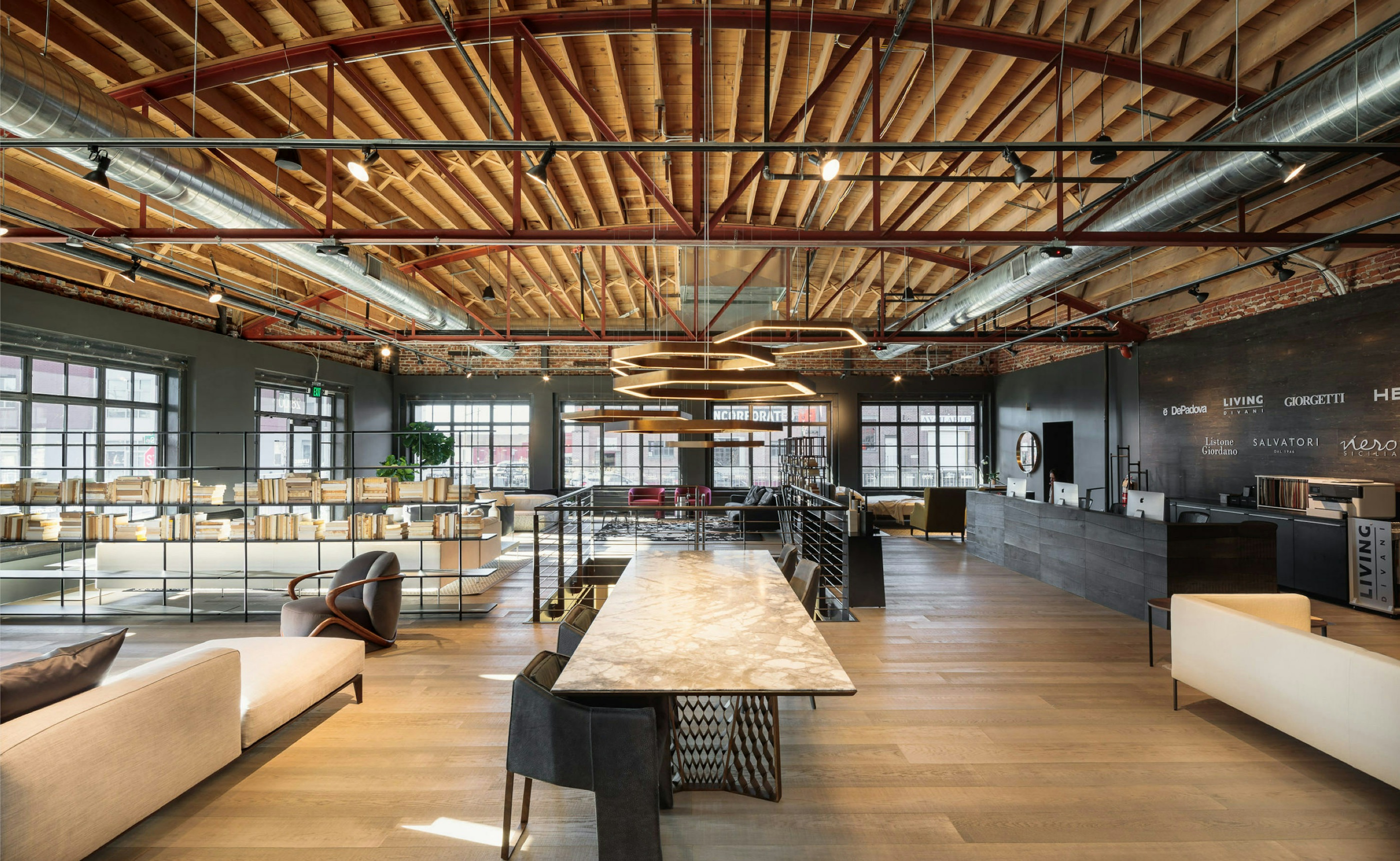
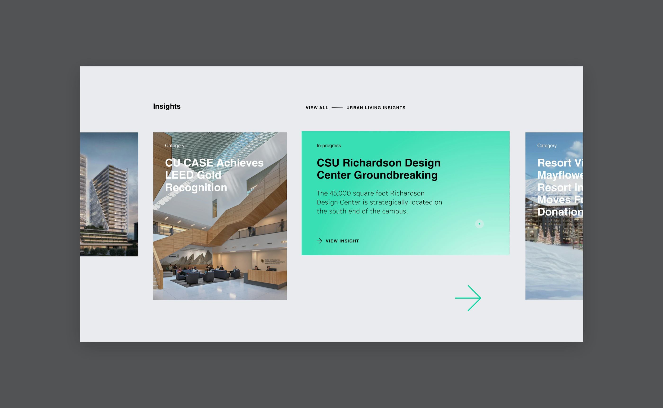
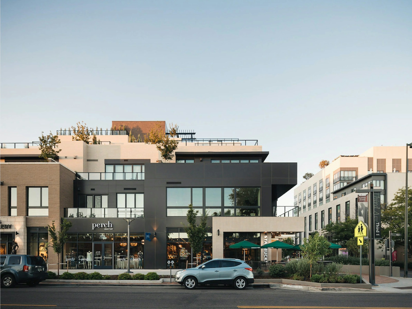
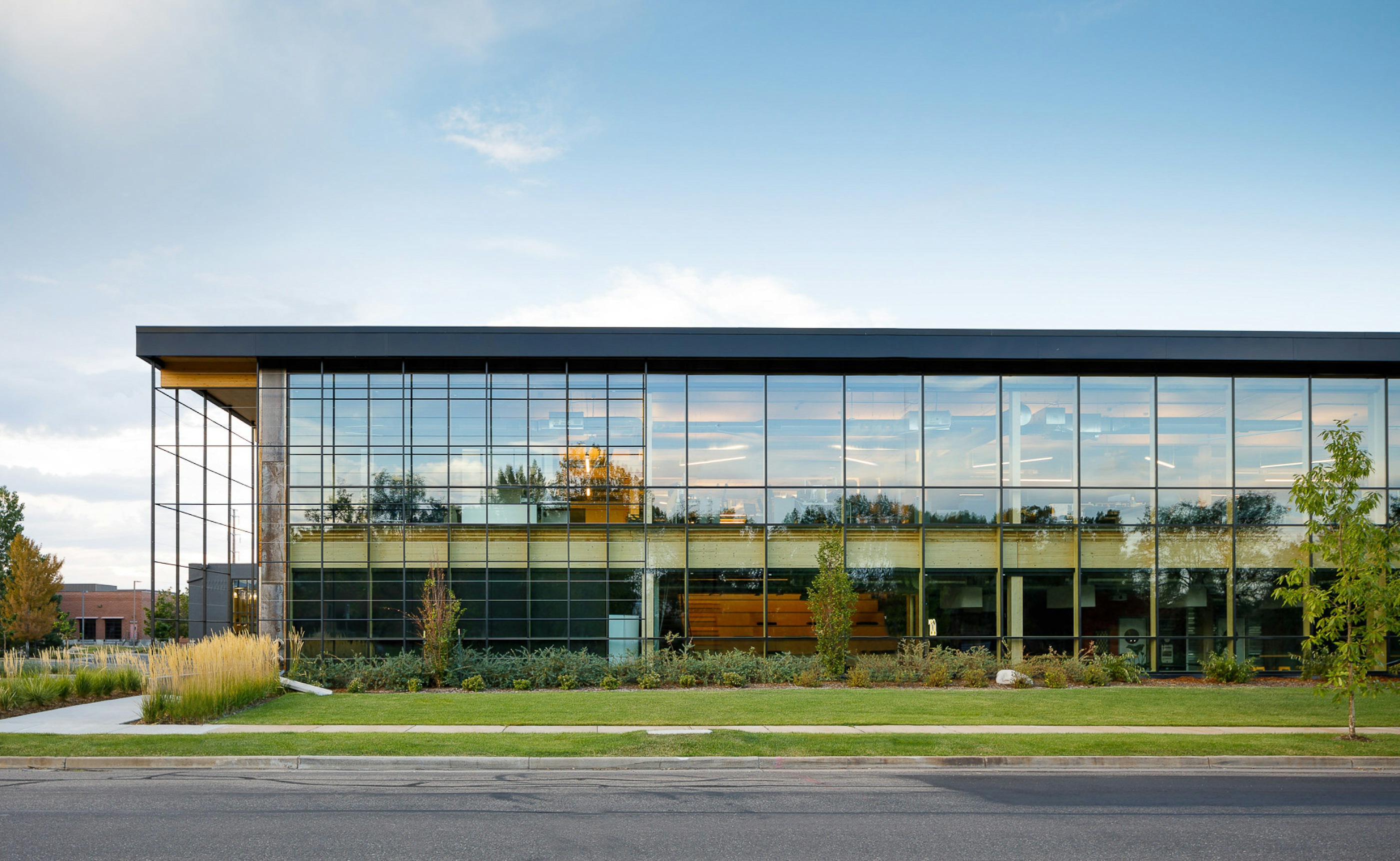
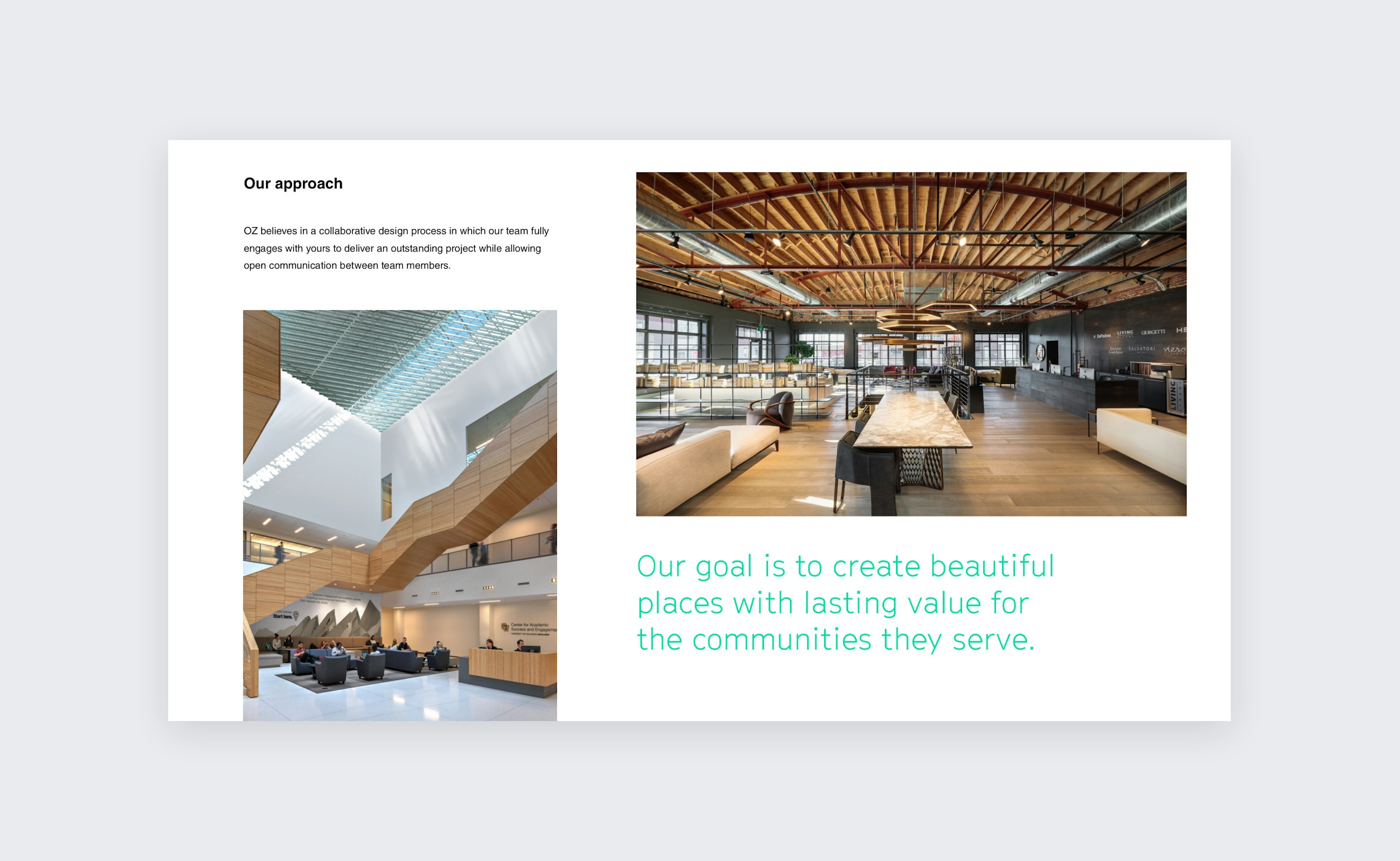
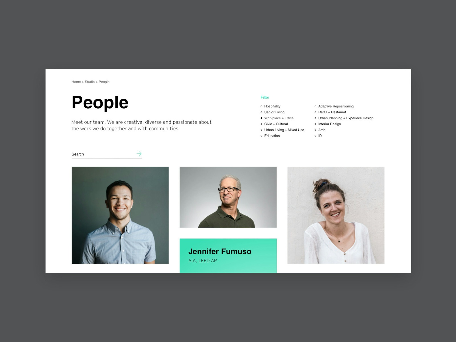
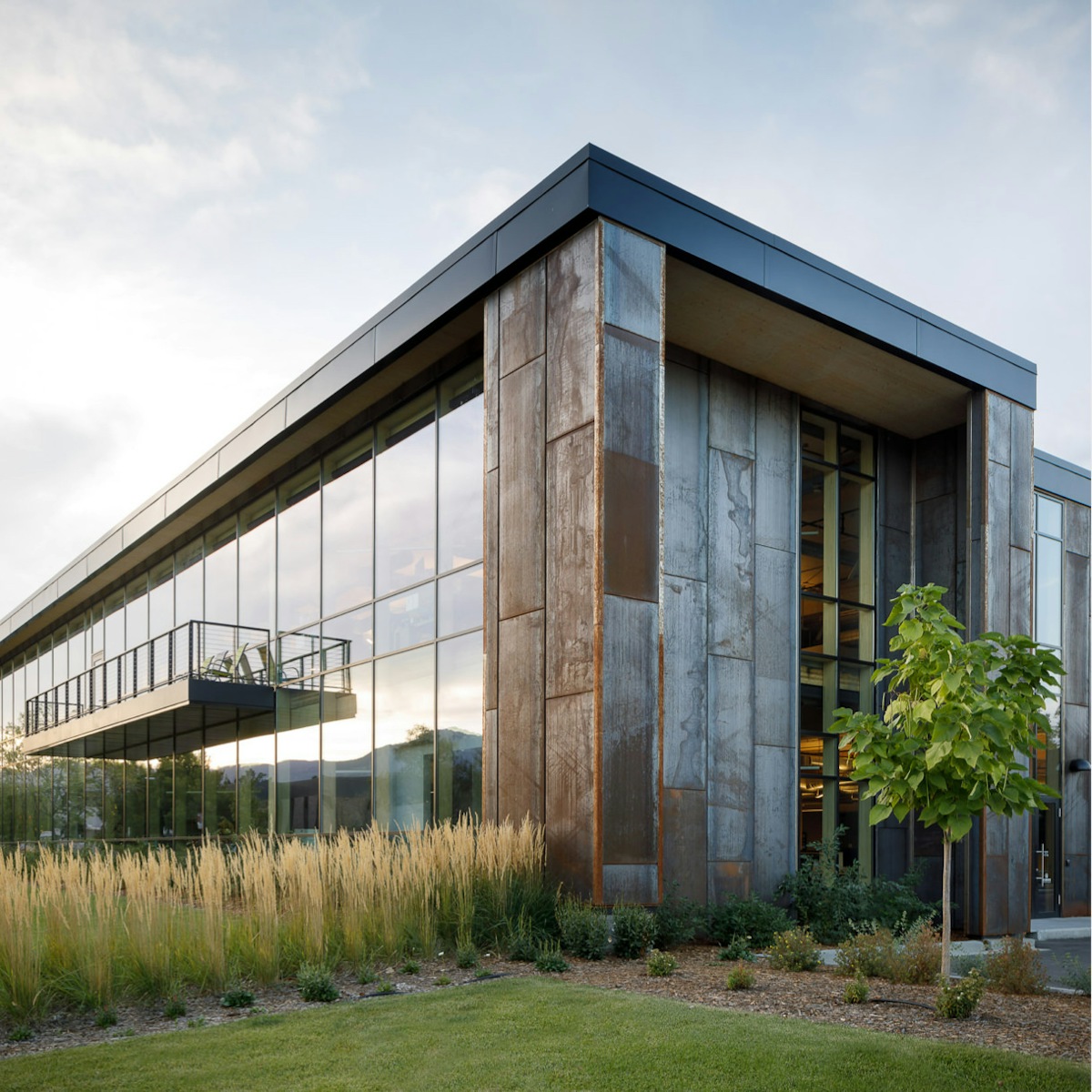
We worked diligently with the OZ team from the beginning to place an emphasis on the work itself, sharing in-progress inspiration alongside beautifully captured photography for every project they touch.
UX Audit
Design Prototypes
Web Design Analysis
Wireframes
Visual Designs
Web Development
Content Migration
CMS Integration

OZ wanted to better represent their hard-earned reputation as leaders in the contemporary architecture and design space online and to ensure that their brand’s digital experience matched the progressive experiences they designed for the built environment. Of course, they also needed a compelling hub to showcase their work.
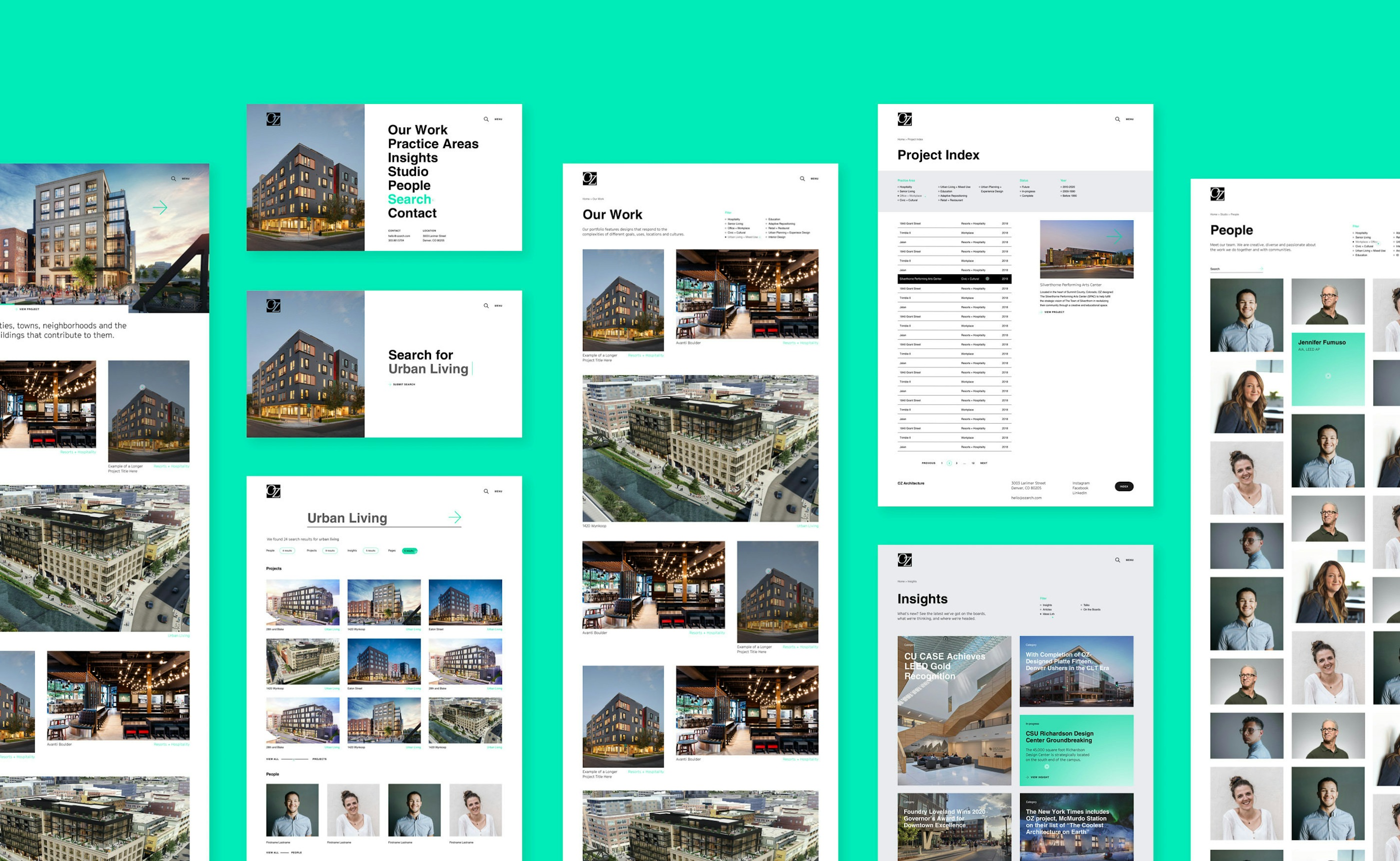
To deliver on OZ’s expectations, we decided to present them with multiple design pathways, revising and iterating according to their feedback, before launching their new website with a mixture of streamlined legacy content and brand-new varnish.
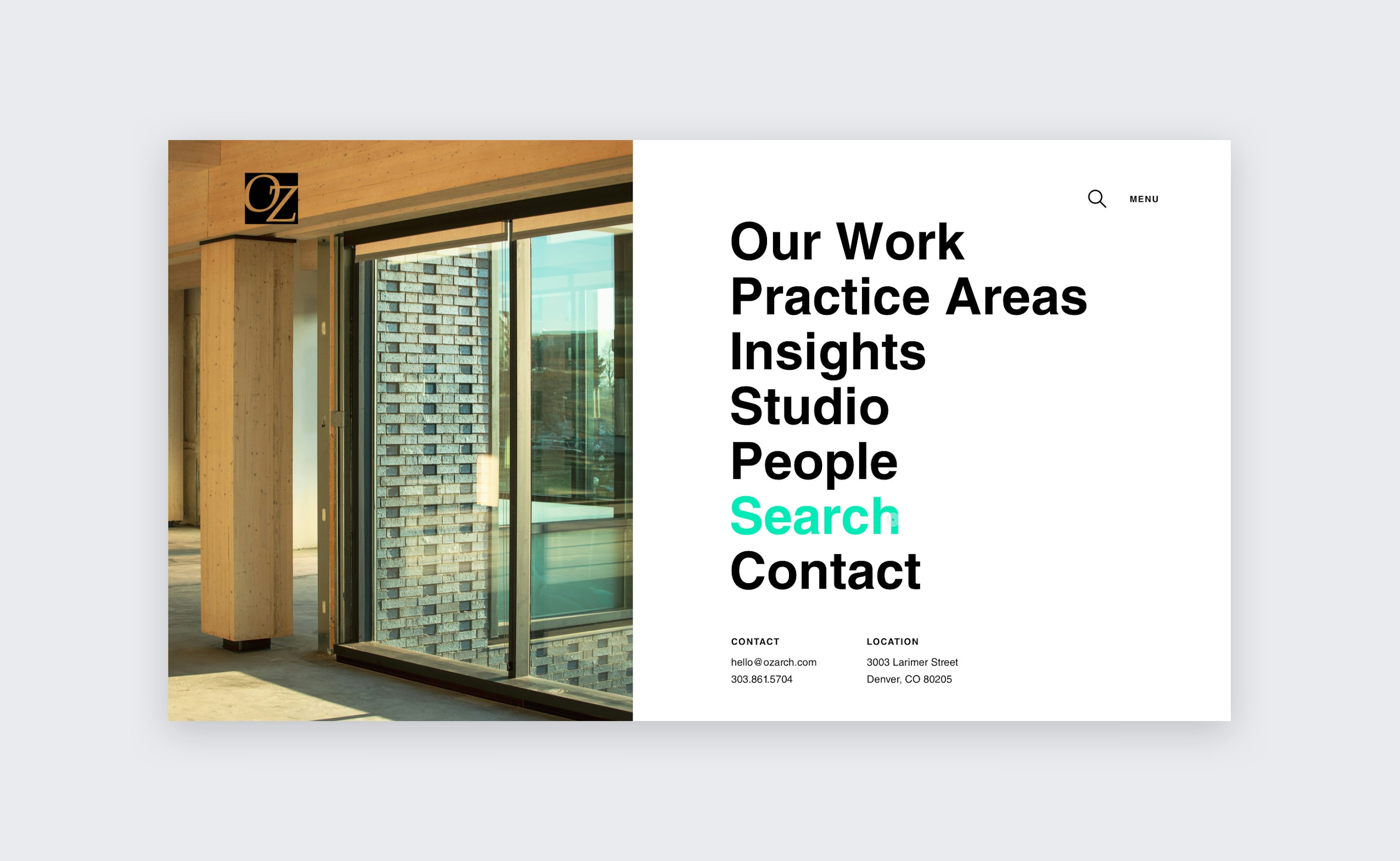
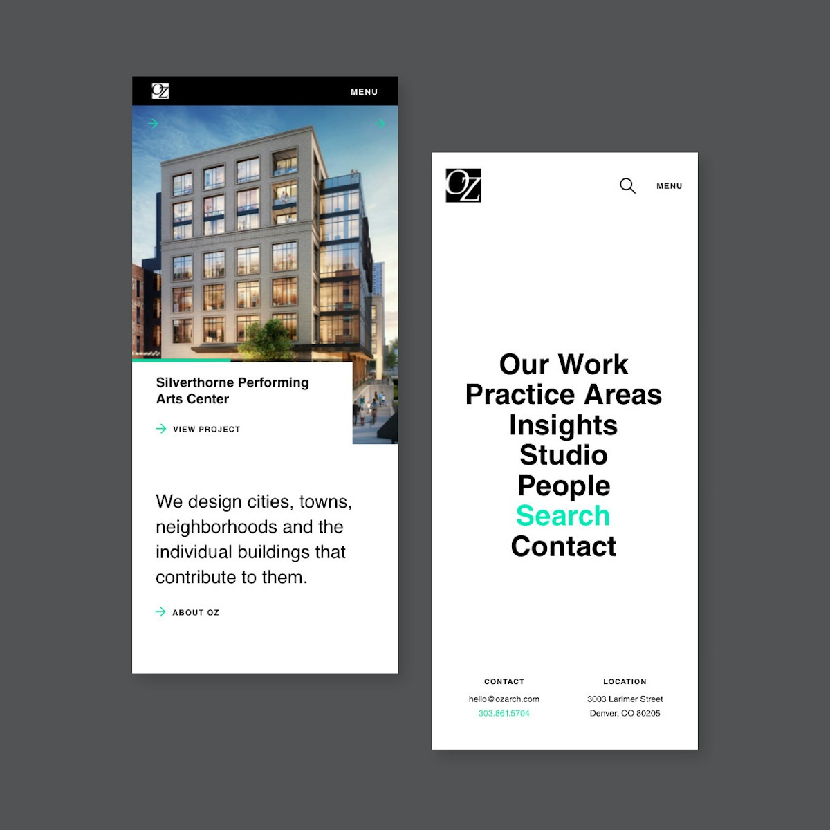
We walked the OZ team through a series of design prototypes. For each design, we highlighted the ways in which we could bring their brand standards and modern aesthetic to life online. We also discussed how contemporary UX and interaction strategies could be leveraged to drive additional user engagement.
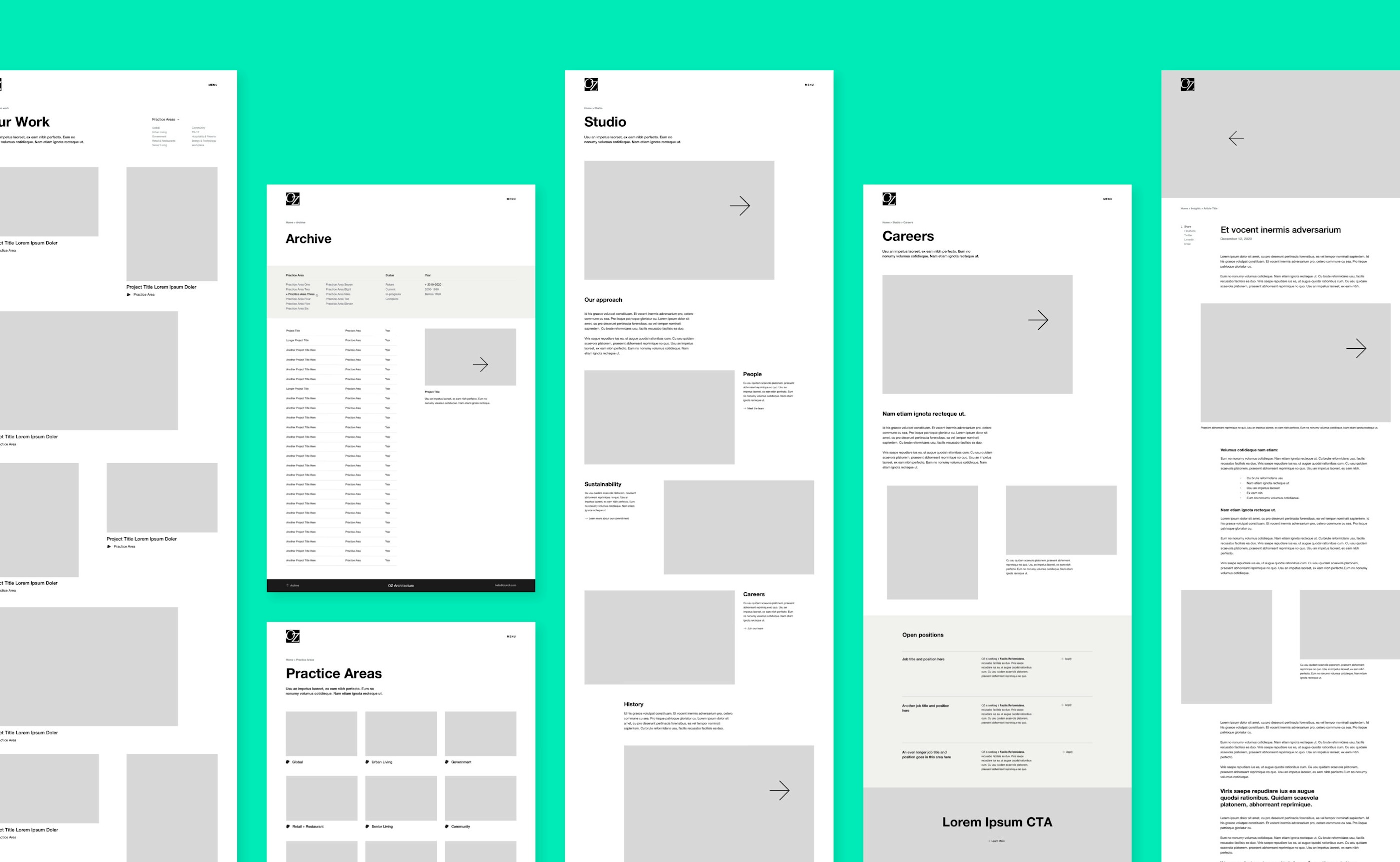
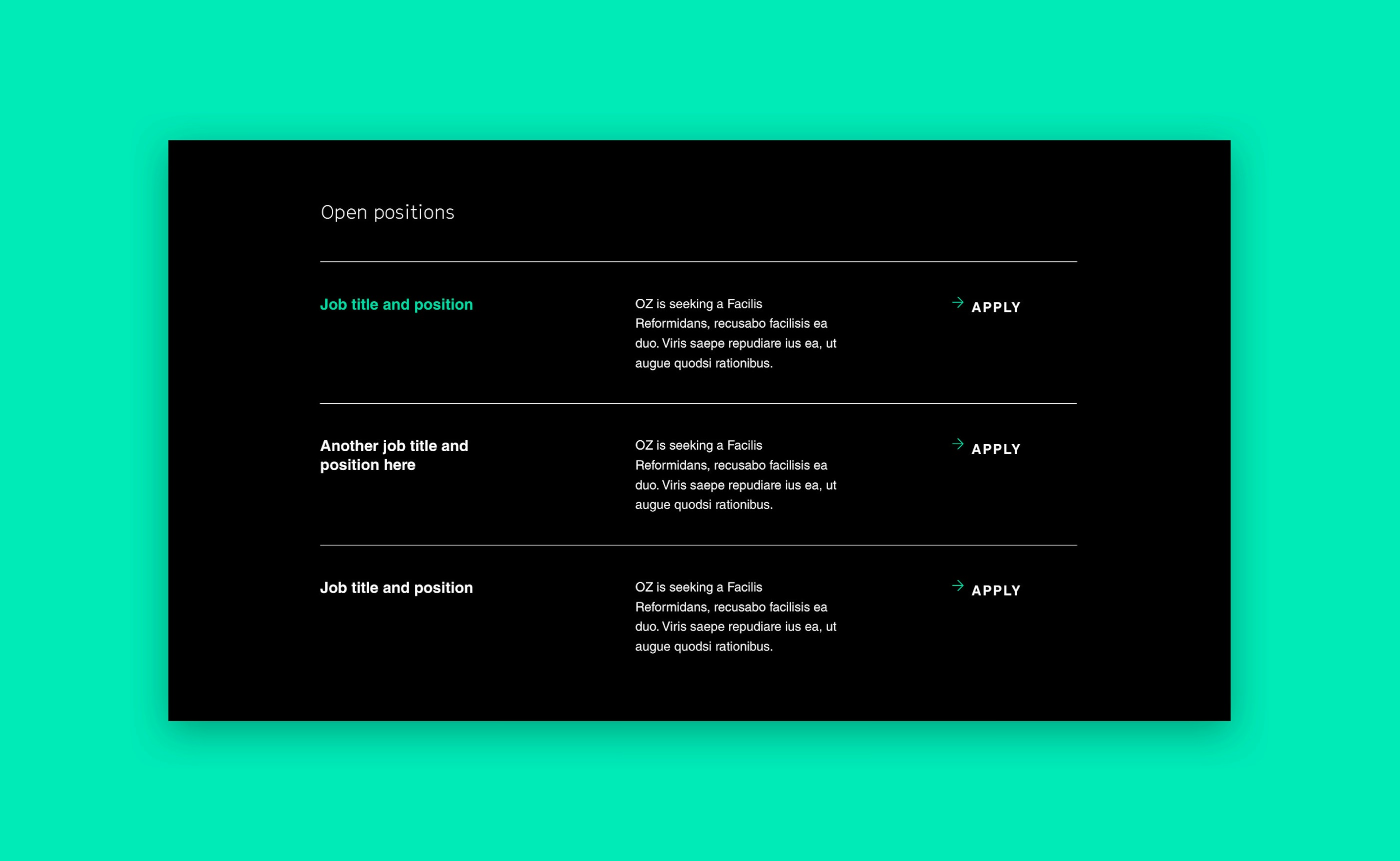
Next, we transitioned into the design process, delivering high-level strategic recommendations and walking them through hands-on wireframing and visual design phases. We produced gorgeous creative assets to make their website visually captivating.
To power their redesigned website, we developed the backend architecture. We configured their site on a powerful content management system and ensured a seamless transition by migrating legacy content from their old website.
Finally, we moved into front-end development, spending ample time on interaction design and micro-animations to create a polished digital experience that was unique, engaging, and a delight for users to explore.
OZ’s new website was faster, more engaging, and got less attention from the wrong eyes. The elegant and detailed design truly embodied their status as an industry leader in architecture.
Subscribe here to get our short and sweet monthly newsletter!